These questions do not ask what a display shows. They ask what it proves: you are given statements and have to keep the ones the picture actually supports and drop the ones that reach past it, however sensible they sound.
How far a display reaches
A chart or a table is a record of particular measurements — certain quantities, for certain cases, over a certain range. A statement is supported when three things hold at once: every quantity it names appears on the display, it stays inside the cases and the range that were measured, and it survives being checked against the values themselves. Fail any one of the three and the statement is unsupported, even if it happens to be true in the world.
| The display can settle this | It cannot settle this |
|---|---|
| Which displayed value is the largest or the smallest | Which value would lead in a period or a group that was not measured |
| How the values changed from one displayed point to the next | What comes next, read off by continuing the movement |
| How displayed parts combine, and what share of a stated total a part is | A quantity that no bar, line or cell carries |
| That two displayed series rose and fell in step | That either of them made the other move |
| What the measured group did | What any wider group does |
The line about two series moving in step is the one exams press hardest. Series can share a shape because one drives the other, because both follow something third that was never drawn, because the influence runs the opposite way, or because a short window is easy for chance to make tidy. A display that records only the series themselves cannot separate those, and it certainly cannot when the proposed cause was never measured at all. The honest sentence stops at the shape.
Then weigh the statement's own words, because they set the standard of proof. Proves, causes, because and therefore demand evidence about mechanisms that a display does not hold. Always and will reach outside the measured range. Every and all must hold at every displayed point or row, so each one is checked. Most does two different jobs, settled in two different ways: chosen most often, or the most common, is a ranking, and the largest displayed value settles it; most of the group, or a majority, is arithmetic, and it needs more than half of the stated total. And a survey speaks for the people who were surveyed, however many they were.
Where the answers are lost
- Promoting a shared shape to a cause. Two series that rise and fall together on one picture invite a sentence about one driving the other. What was recorded is that they moved alike; nothing in the picture separates a cause from a common season, a coincidence or a link running the other way.
- Picking which of the two is the cause. When the story can be told in either direction with equal ease, that ease is the evidence that there is no evidence. The option naming the opposite driver is exactly as unsupported as the first one, and choosing between them is not a reading task.
- Reading an index as an amount. A series drawn against a base value, a percentage or any other relative scale describes movement, not size. Two such series running close together say their changes were alike; they never say the underlying quantities were equal, which the display does not carry at all.
- Turning the largest group into a majority. The category chosen more often than any other holds a rank, and its leading count is what supports that rank; the same count is not enough for a statement that most of the group, or a majority, chose it, because with the choices spread over several categories the leader is usually short of half. So read which of the two the statement claims: for most of them or a majority, compare the leading count with half of the stated total; for most often or most common, the ranking already settles it.
Try it yourself
According to the chart, which conclusion is supported by the displayed sales data?
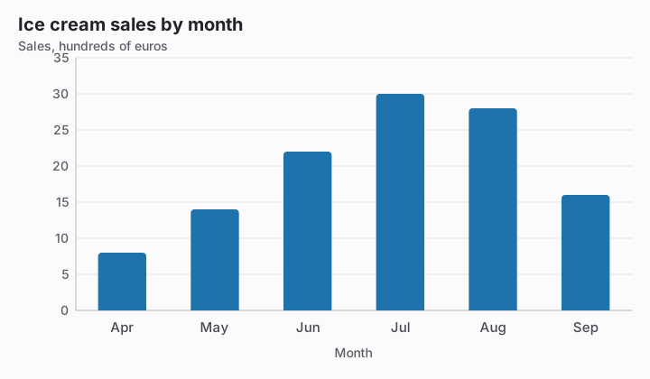
- Hot weather caused people to buy more ice cream.
- Sales were highest in July.
- July will always have the highest sales.
- Every month sold more than the month before.
Based on the chart, what can be concluded about the company's total revenue for the full year?
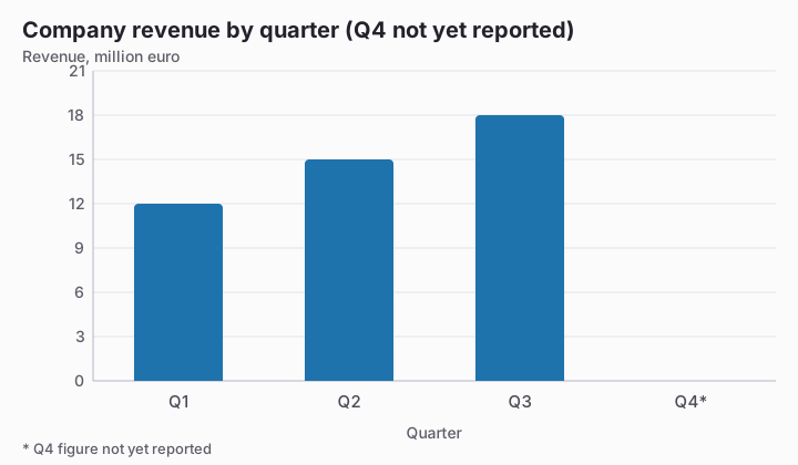
- The yearly total cannot be calculated yet.
- Revenue fell during the reported quarters.
- Q4 revenue was 21 million euro.
- Annual revenue was 45 million euro.