These questions test whether you read the axis before the picture. The drawing is accurate, yet how large a difference looks depends on where the value axis begins, what unit its label carries, and which quantity is being plotted at all.
Four checks before you read a value
Run these four checks on the value axis every time. They take seconds, and each of them changes the answer when it is skipped.
| Check | Why it changes the answer |
|---|---|
| What quantity is named | A chart may plot a level, a share of a whole, or a rate of change; these are different things, and only the axis label says which one is drawn |
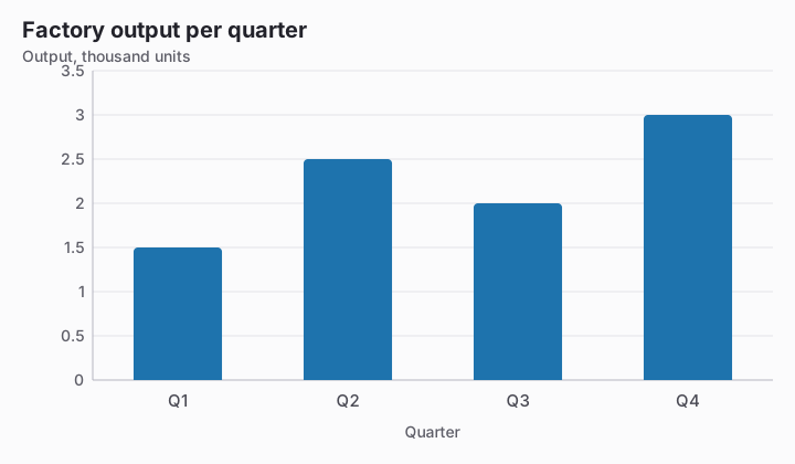
| Which unit the label carries | A label counted in millions, or in percent, means the plotted numbers are expressed in those units, so the plain count is the plotted number scaled by that word |
| Where the axis starts | An axis that begins above zero cuts the same amount off every bar, which makes the remaining stubs look far more different from one another than the values are |
| How large the gridline step is | The step tells you how much one interval is worth, and therefore what a value between two labelled lines can be |
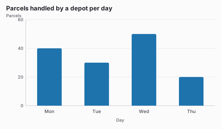
After the checks, read values, not shapes. Where a bar or a point ends between two labelled gridlines, split the interval: an end that sits a fraction of the way from the lower line to the upper one is worth that same fraction of a step above the lower line's number. A difference between two categories is then the subtraction of the two read values, and it stays the same number however dramatic or however flat the picture happens to look.
Where the marks are lost
- Believing the proportions of a truncated axis. When the axis starts above zero, one bar can look several times another while the values behind them sit close together, and the offered differences include gaps far wider than the printed labels allow.
- Taking the drawn part of a bar for the answer. On a cut axis the height a bar rises above the bottom of the plotting area is neither its value nor its distance from another bar, and counting the gridlines between two bar ends gives a number of intervals, not a quantity, unless one interval happens to be worth one unit; both readings come from the printed numbers.
- Reading a shrinking series of rates as a fall in the quantity itself. A rate axis measures how fast something changes, so while the plotted rates stay above zero the underlying amount is larger at the end of each period than at the start, and shorter bars here mean slower growth rather than decline.
- Answering as if the options described the bars rather than the quantity. On a rate axis only a bar of zero height reports a quantity that did not move, and a return to where the quantity started would take a rate far below the bottom of the scale, which is not something the chart shows.
Try it
According to the chart, how many units did the factory produce in Q2?
- 250 units
- 2,500 units
- 25 units
- 2.5 units
According to the chart, which value is closest to the number of parcels handled on Tuesday?
- 20 parcels
- 40 parcels
- 30 parcels
- 50 parcels