QuestenaPractice that shows what to review next
Question 25

According to the chart, which conclusion is supported by the displayed sales data?
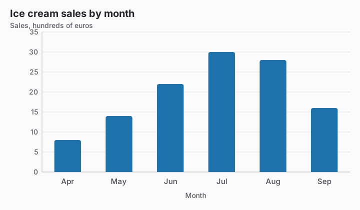
Bar chart titled Ice cream sales by month. Value axis: Sales, hundreds of euros, gridlines every 5 from 0 to 35. Data: Apr 8, May 14, Jun 22, Jul 30, Aug 28, Sep 16.
  1. Hot weather caused people to buy more ice cream.
  2. Sales were highest in July.Correct answer
  3. July will always have the highest sales.
  4. Every month sold more than the month before.

Explanation

July has the greatest displayed value, 3,000 euros, so the chart supports a peak within this six-month period. It does not measure temperature or repeat across years, so it cannot establish heat as a cause or guarantee the same peak every year.

Continue with this test

Start practice
Question 25: According to the chart, which conclusion is supported by… · Reading Charts and Tables · Questena