A line chart question asks you to read one measurement, to compare two lines at the same moment, or to judge which description of the movement is fair. The line looks continuous, but the evidence is the marked points, and the wording of the option decides how much of the line you have to check.
The points carry the data
Start with the axis labels. The horizontal axis says what the sequence is measured against, usually time; the value axis says what is measured, in which unit, and with which gridline step. Two details of the value axis change readings: a unit word in the label, such as thousands, means the plotted numbers are counted in those units, and an axis that starts above zero still gives correct values, so you read the labels rather than the height of the line above the frame.
To read one measurement, find the label on the horizontal axis, go up to the point that sits above it, and read across to the scale, interpolating if the point falls between gridlines. To compare two lines, do that twice at the same horizontal position; the answer to how much more is the vertical distance between the two points, not either point on its own. When you are asked where the order of two series changes, work left to right and stop at the earliest position where the two points have actually swapped places.
| What the question asks | How much of the line you check |
|---|---|
| The highest or lowest measured value | Every plotted point, since the extreme can sit anywhere in the sequence |
| A value at one named position | That one point, read against the scale |
| How much more one line is than the other | The two points at the same position, then subtract |
| Which description of the trend fits | The two ends for the overall direction, then each segment for words such as steadily or every |
| Which statements are supported | Each statement separately; several may hold at once |
Where the marks are lost
- Answering how much more with one line's own value. When two lines are plotted, the value of either of them at the named position is offered as an option, and it is the gap between them that was asked for.
- Reading the plotted number as the count when the axis label carries a unit word. The plotted figure has to be scaled by that word, and options are built from both the unscaled figure and a scaling by the wrong factor.
- Summarising a trend in the wrong direction. An option that describes steady growth for a series that ends below where it began matches the feel of a busy line, not its two ends.
- Accepting words such as without interruption or every month for a series that moves the right way overall but has one contrary step. The overall direction and an unbroken run are two different claims, and one step against the run settles the second.
- Extending a run seen at the start of the period to the whole period. In a select-all question, a claim about the entire span can fail on the last segment alone, while several separate comparisons across the same chart can all be true together.
Try it
According to the chart, at which measured time was the air temperature highest?
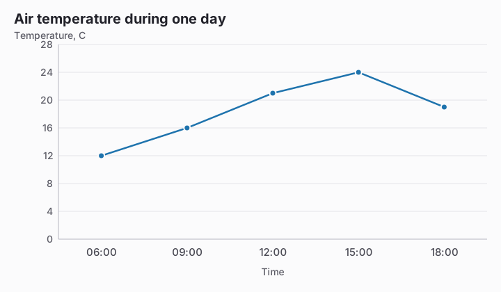
- 12:00
- 18:00
- 15:00
- 09:00
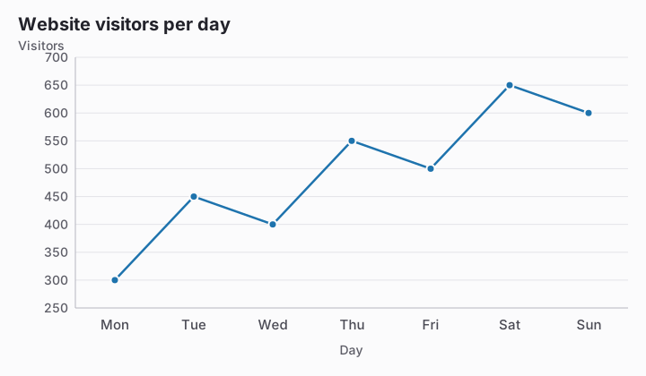
According to the chart, how many visitors used the website on Friday? Enter the number of visitors.
According to the chart, in which quarter did App X first record more downloads than App Y?
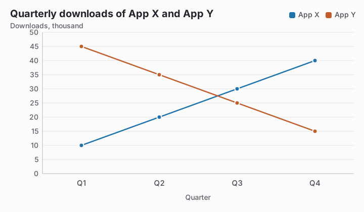
- Q2
- Q4
- Q1
- Q3